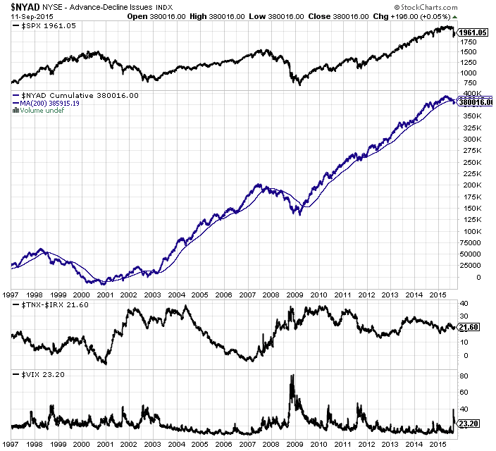
The following chart is my window into the market, a snapshot that I glance at every day. It provides me a wealth of information of the overall U.S. stock market, all in one glance.
The topmost section charts the price action of the U.S. stock market (S&P 500). The second section charts the NYSE advance/decline cumulative average, along with its 200-day moving average. The third section charts the treasury yield curve (10-year minus 3-month yield). The bottom section charts the S&P 500 volatility index (VIX).
The current takeaway is that we're experiencing a correction, the total depth of it being -12.4% (so far). The NYSE advance/decline cumulative average has crossed below its 200-day moving average, which is a warning sign. However, if history is to repeat itself (which of course isn't a given), for there to be a major bear market looming (save a black swan event, such as the Black Monday crash of 1987), the treasury yield curve should've dipped below 0, which as we can see is not even close to it.
I like to look at the VIX to seek out potential crowd fear moments. For me, if the VIX spikes above 40, it's often a great way to take advantage of a pullback, as long as the upward trend resumes and we don't enter a bear market. The VIX spiked over 40 on August 24, 2015, and ever since the $SPX has recovered +4.8%. Whether the upward trend resumes shall remain to be seen.
Feel free to modify the chart to your liking, using the link to it below.
QH Market Snapshot